Museum Artifacts: 1933 Chicago World’s Fair Postcards (C.T. American Art and C.T. Colortone), published by Max Rigot Selling Company
Made By: Curt Teich & Company, 1733-1755 W. Irving Park Rd., Chicago, IL [Lakeview]
“If one were seeking the vernacular aesthetic of a period, the postcard is where you will find it . . . It is the least elitist form of artefact.” —Tom Phillips, The Postcard Century, 2000
For inhabitants of the internet age, picture postcards are generally seen as “quaint” little things of the past; folksy cardboard novelties in a four-cornered, dime-a-dozen format. They’re certainly not obsolete today, mind you—sending one as a romantic or ironic gesture still sustains an industry. But when a text or tweet can deliver a clichéd “Wish You Were Here” in realtime, there’s just less practical purpose for having it hand-delivered a week later.
 Naturally, the postcard played a very different role in the public consciousness 100 years ago. Yes, you might still feel a sense of FOMO (“fear of missing out”) upon receiving one, but there was nothing twee or nostalgic about it. Quite the contrary. A postcard—particularly one of the artful designs created by the largest postcard maker in the world, Chicago’s Curt Teich & Company—was often a recipient’s first full-color, visual introduction to a place . . . be it a famous landmark or just some random office building a few towns over. Was it always a “true to life” depiction of that place? Well . . . not so much. But the surprisingly complex process required to make a one-cent postcard—and the choreographed intent baked into every edit and emphasis therein—has really had a lasting cultural impact beyond anything the postcard manufacturer or its clients could have imagined.
“One of the important things about the Teich company is that they printed whatever came through their doors,” says Katherine Hamilton-Smith, who presided over the Teich postcard archives when they were housed at the Lake County Discovery Museum [they have since moved to Chicago’s Newberry Library]. “So it is what I call an un-curated collection. There was nobody saying, ‘well, I like that, but I don’t like that.’ If a job came in the door, they printed it. And so, it is America curating itself, in a sense. [Teich postcards] reveal how America saw itself in the 20th century.”

History of Curt Teich & Co., Part I: Alignment of the Planets
Curt Otto Teich was neither famous nor an “artist”—per se—but his contributions to America’s modern self-image arguably land right at the confluence of Norman Rockwell and Andy Warhol.
Born in Greiz, Germany, in 1877, Curt grew up largely in the scenic medieval castle town of Lobenstein, where his family already had deep roots in the printing trade. Grandpa Friedrich Teich had started a print shop in the town and published a local newspaper, while Curt’s dad, Christian Teich, acquired several additional newspapers in the mid 1800s, along with a publishing company and a printing firm in Dresden. It was Christian, in fact—along with Curt’s older brother Max—who were first to represent the Teich family interests in Chicago. While teenage Curt was still stuck back home with his school work, Christian and Max set off on a two-year business expedition of sorts, arriving in Chicago specifically to grab some inspiration and make connections at the World’s Columbian Exposition of 1893. Max didn’t even bother coming home—he got into the hotel business—and while papa Christian returned to Deutschland in 1895, his reunion with a now 18 year-old Curt would be brief.
 Some sources claim that Curt’s father encouraged him to go to America and join his brother Max; others describe it as more of a rebellious act, with a bull-headed Curt eager to prove himself on his own terms. Either way, the future Postcard King sailed to the States, possibly as a solo passenger, in 1895, and after knocking around some print shops in New York City, he eventually headed west and met up with his bro in Chicago. By 1898, thanks in part to a substantial investment of hotel money from Max, Curt Teich started up his own printing business, with an office inside the “Industry Building” at 85 Fifth Avenue (the site is roughly equivalent to what is now 504 N. Wells Street). His optimism, however, hadn’t yet lined up with his ambition.
“Business conditions were poor at the time,” Teich later wrote. “Many visitors to the Chicago World’s Fair had remained, and every profession and trade was over-crowded. [We] specialized in job, newspaper and magazine printing; competition was fierce and price cutting prevalent. A fair living, that’s all, was the result.”
That description, straight from Curt Teich’s own 1958 quasi-memoir, The Teich’s Family Tree and History, slightly contradicts the more romantic origin story that became company lore. In that version, Curt almost immediately recognized the oncoming phenomenon of the view postcard, and traveled across America by rail in 1898 to start documenting locations and collecting orders.
“Every time the train stopped,” his son Ralph Teich claimed in a 1982 interview, “[Curt] got off with his camera, his order pad, and his idea.”
In that same fairytale narrative, Curt Teich—21 years old and still learning English—managed to come back to Chicago with $30,000 worth of orders, launching his coast-to-coast postcard empire in the process. In reality, of course, a great deal more scratching and clawing was required.
For one thing, the U.S. Postal Service was quite slow to recognize the viability and popular potential of picture postcards. While the earliest view cards had become sought-after souvenirs of the aforementioned 1893 World’s Fair, the format wasn’t really compatible with the official “postal card” regulations of the day, which required that (a) all privately made cards cost 2 cents rather than the standard 1 cent, and (b) one entire side of the card had to be reserved solely for the recipient’s address and postage. The latter rule meant that any hand-written messages from the sender had to be jammed alongside the picture on the front of the card, leading to a lot of squinting by the recipient and some unintended smudging of scenic landscapes.

[A 1905 Teich postcard reveals how messages had to be written on the front of cards prior to 1907, as the government required one full side of the card to be reserved for the postage and address]
These issues were eventually resolved with the standardization of the 1-cent rate (1898) and introduction of the familiar “divided back” style of postcard (1907). Still, for American postcard makers, an even bigger obstacle loomed in the form of seemingly insurmountable competition from Curt Teich’s native land of Germany. Through most of the first decade of the 1900s, an estimated 90% of all postcards sold in the United States were imported from the Germans, whose advanced lithograph printing techniques—and the lower costs associated with them—led to a near monopoly over the industry. Even photographs depicting obscure local sites in middle America usually were sent off across the Atlantic by U.S. publishers before returning as purchasable postcards.
 When Curt Teich and his fresh-off-the-boat younger brother Alfred officially incorporated their upstart postcard business in 1904, they, too, were relying heavily on cards imported from back home, rather than wide-scale manufacturing at their own Chicago plant (by then located at 117-123 E. Lake Street). Their new organization, which also included Max Teich as the largest shareholder, was briefly called the American Photochrom Company, but quickly switched back to its original working title, Curt Teich & Co., after Alfred went rogue and formed his own short-lived firm called . . . Alfred Teich & Co.
The next few years were pivotal, not just for the business, but the industry as a whole. As American postcard purchases started topping the one BILLION mark annually, it became clear that there was as much—if not more—interest in views of local sites and businesses as there was in more famous, faraway lands.
“This is right at the beginning of the 20th century,” Katherine Hamilton-Smith explained during a 2018 talk at the Newberry Library. “This is the moment when American towns and cities are emerging now 30 years after the Civil War, and they are changing at an unprecedented pace. So to have the coupling of the phenomenon of picture postcards happen at the very same time that America is changing and burgeoning at this rate was a very special alignment of the planets, if you will.”
As often happens in the first years of a new booming industry, the picture postcard marketplace looked like the Wild West for a time—ruled by Germany, but flooded with opportunist American publishers of every stripe. Teich & Co. (both Curt and Alfred’s versions) was merely part of a herd of postcard producers jockeying for position, including established manufacturers like the Detroit Publishing Co. (Detroit, MI), E.C. Kropp Co. (Milwaukee, WI), American News Company (New York, NY), and Albertype Company (Brooklyn, NY), plus a rising Teich nemesis out of Boston called Tichnor Bros., Inc.

[One of Teich’s many rivals was the Alfred Holzman Co., also of Chicago, whose factory at 2815 Wabash was supposedly the largest postcard plant in the world as late as 1908]
Even within the city limits of Chicago, there were competitors aplenty emerging every day from Printer’s Row and further afield, including: J. Regan & Co., Maurice Wells & Co., the Illinois Post Card Co., V. O. Hammon Publishing Co., C. R. Childs Co., Franklin Post Card Co., the American Photocolortype Company, the Chicago Souvenir & Novelty Co., and the Alfred Holzman Company.
For a while, in fact, it looked like Alfred Holzman, rather than Curt Teich, would be the most noteworthy purveyor of the medium, as his factory on Wabash Avenue employed 300 workers by 1908, and claimed itself the “largest building in America devoted exclusively to the manufacture of post cards.” That would not be the case for long.
In 1909, when Congress passed the new Payne-Aldrich tariff—imposing an import duty on all view cards coming in from Germany—the American printing houses all celebrated their good fortune. Only one, however, was truly in prime position to fill the production gap that the Germans were leaving behind. “It takes one to know one,” as they say, and nobody knew the latest German printing methods quite like Curt Teich.
II. Studious Attention
“Germany and France have, for some time, held the palm for color reproduction, through process printing and lithographing, but it appears that at least one American has not been content that the United States should forever occupy a second place in this respect. Mr. Curt Teich, of the firm of Curt Teich & Co., Chicago, the well-known postcard publishers, has given special attention to this subject, and has evolved some processes of his own from which results have been secured that are equal in all and superior in some respects to the best work of the European print shops. This fact can be seen at a glance by any one who is familiar with the handsome post-cards which come from his establishment.” —National Druggist, September 1907
 Curt Teich came from a long line of German printers, but he wasn’t interested in being a traditionalist. He knew that selling a one-cent product— simultaneously offered by hordes of competitors—would require superior quality and volume at a cost-effective rate. So, right after incorporating Teich & Co., he went on reconnaissance missions back to Germany to see how the leaders in lithography were beating everyone else at the game.
At the time, “real photo” postcards, pioneered by Kodak, were available, but had to be printed by hand, making them a non-starter for wide distribution. As such, several standard methods were employed by printers to reproduce semi-realistic looking photographic images for bulk postcard production, often with artistic retouching and colorization involved. These included the laborious Collotype printing process and the Halftone process, both of which were part of Teich’s arsenal. By 1907, though, Curt was breaking away from the pack, mixing and matching methodologies and adding in new tricks he’d picked up in the motherland. That year—coinciding with the introduction of “divided back” cards and the opening of a new five-story Teich factory at 125 W. Ohio Street—he began promoting a new line-up of distinct “CT Processes,” which had been developed with help from his art director Otto Buettner (another Lobenstein native) and his Austrian-born printing department manager, Frank Hochegger.
“Perhaps no one in the field has given more studious attention to the highest expression of the printing and lithographing art than Curt Teich,” claimed an article in the American Stationer. “. . . His process starts with the treatment of the photographs, which are first retouched. All objectionable parts are removed, weak places strengthened, and the picture perfected for re-photographing. This re-photographing is done on two different plates, one on copper and one on zinc, and made into what is called a ‘countersunk.’ . . . The double printing from the two plates serves to make the picture ‘stand up’ —the finest details, which cannot be seen with the naked eye on the original photo, are brought out. The picture is now perfectly even, showing the highlights, shadows and the perspective and detail which cannot be obtained any other way.
“Of these different ‘CT’ processes the ‘CT Photochrom’ is the most notable, as it brings out the finest details produced by the camera. Not only are the exact colors of the original in all their richness of tint and tone faithfully reproduced, but there is also assured the true perspective and depth of the picture.”

[An example of four of Teich’s “CT Photochrom” postcards from the early 1910s]
Unsurprisingly, many of Teich’s techniques were quickly imitated by other printers, so he turned his attention to a more significant separator—the machinery.
Even though Teich & Co. was still operating at a deficit after 10 years in business, the decision was made to invest in several new high-speed, offset rotary presses—massive machines that could rapidly print 32 different card designs, in full color, on one sheet. As an added wrinkle, Curt also devised a cost-saving hybrid method that was inspired by German trends, but still uniquely his own. It essentially involved combining traditional letterpress printing (with a black halftone base) and offset lithography, which could overprint four-color inks.

“Litho stones were replaced by metal plates,” Teich wrote in his memoir, “grained by rounded small stones, gathered at Chicago’s Lake Michigan front. The artists traced the outlines of the colors on the plates, then designed the four separate color plates: yellow, red, blue, and pink. The zinc plates were etched, inked and hand impressions pulled on china and Columbia transfer paper. Postcard designs were assembled, 32 subjects to a sheet, halftones made from the black photographs and printed on cardboard in black ink on Miehle presses. Colored impressions were assembled, stuck up and pulled over on larger stones for color lithographing. The new process was named the ‘C. T. American Art’ process.”
Once German import competition was squashed in 1909, Teich’s increasingly eye-catching designs and growing fleet of offset presses (soon able to print 100+ cards on one sheet and roughly 500,000 cards per day, per machine) sent his business blazing into the 1910s. A team of 10 print shop workers back in 1901 had grown to 80 by 1906, and 190 by 1911, when the company purchased an expansive new headquarters at 1745 W. Irving Park Road. Many of the employees making the move to the new building were fellow German immigrants and uniquely trained artists, specializing in photolithography, as well as drawing and retouching. Perhaps the most important members of the Teich team, though—the ones out on the road—rarely set foot in the building.

[Left: Teich employees working a fleet of press machines. Right: Teich’s Chicago factory at Irving Park, Ravenswood and Hermitage as it looked in the 1910s, before a major five-story addition in 1922]
III. Specializing in the Unspecial
“Richest in colors, best in material, made in the largest and most complete factory in the United States by expert artists. We manufacture more colored local view post cards than all others combined and guarantee prompt shipments. Send us your orders, photographs and get the BEST COLORED VIEW CARDS MADE.” —Curt Teich & Co., Inc., 1913 advertisement

When the “golden age” of postcards ended, i.e., when the initial bubble burst on sales slowed just before World War I, hundreds of publishers either folded or counted their losses and moved along to the next trend. Curt Teich was one of the exceptions; not only surviving, but thriving. Yes, machining and technical prowess had played a large part in the firm’s emergence as the standard-bearers for the trade, but mass production only mattered if you also had the orders to fill, and Teich mobilized client acquisition better than anyone else.
“The view postcard is not a fad or a passing fancy,” Curt Teich wrote in a 1913 issue of the American Stationer, “and for this reason is it necessary that a great deal of attention should be paid to the nursing of the industry, just as with any other article which wants to stay in front and keep going.
“. . . We have divided the United States into six territories. In each territory we have stationed a representative, whose only duty is to help along the customer in every possible way to secure good photographs, weeding out any bad subjects from poor photographs, and keeping the stock in a healthy condition. . . .

[This 1932 Teich card features one of the company’s longtime photographers and reps, B. P. Atkinson of New Hampshire: “The Post Card Man: I Have the Winning Cards.”]
“Every one of our representatives, Teich continued, “is a practical postcard man, knowing the manufacturing process. We employ the best artists and mechanics and have arrangements with the best photographers all over the country to supply us with the best photographs which can be made. It has taken us many years and an outlay of a great deal of money and energy to build up our organization, but our efforts have been fully repaid by the enormous volume of business we receive both for new and reprint work.”
 By the 1910s, Teich & Co. was producing about 150 million postcards annually, a large percentage of which were being purchased at so-called “five and dime” stores, such as F. W. Woolworth, where racks of local interest cards were routinely picked over and restocked. Teich saw this development early on, and became an exclusive supplier to Woolworth and other similar retailers. He also didn’t mind printing cards for other independent publishers, like Chicago’s prolific Max Rigot Selling Co. These partnerships further solidified Teich’s dominance in the marketplace, but impressively didn’t alter his business model much.
Rather than just reprinting the most popular postcards over and over, he emphasized rapid turn-over and hyper-local subject matter more than ever, keeping an insanely detailed inventory of each and every card’s shelf life.
“After a view is two or three seasons old, it will not sell,” Teich claimed. “. . . We created a statistical department, which keeps track of every subject ever made up. About 120,000 different views, covering the entire United States, Canada, Cuba, Puerto Rico, the Hawaiian Islands, and Mexico have been published. By this system we can tell very quickly when sales are increasing or decreasing in any specified territory. . . . In a number of smaller cities the comment is made that every possible view has already been photographed and made up into postcards, and that there is nothing left to be made up. This is a wrong idea. Every subject can be improved and made a good seller again by taking the photograph from a different angle and working it over into a night scene or a border card. The goods must show enough originality to create the greatest demand for view postcards by the public.”

[Some of the many different views of Chicago’s Wrigley Building that Teich & Co. published over the years]
No town was too small for a Teich sales agent to pay it a visit, and no visit was ever fruitless enough not to warrant a return. Beyond meeting regularly with the photographers in said region, there would be regular glad-handing with local business and restaurant owners, town councils, club members, etc.—anyone who might have a place in mind for colorful cardboard immortalization. By supplying “made-to-order” postcards tied to small-town civic pride, Teich somewhat inadvertently began documenting both the extraordinary and the mundane corners of American life.
 “Some of these views wouldn’t otherwise exist for us today, because they weren’t special in any way,” says Katherine Hamilton-Smith. “It is a form of boosterism of place as place changed in the 20th century. So the un-specialness of picture postcards in these early decades is what makes them so special in my mind.”
As noted earlier, however, the everyday places represented on Teich postcards aren’t necessarily photo-journalistic. They’re usually tinted—not just by slightly surreal-looking color printing techniques, but by the rose-colored glasses of the people who commissioned them. The salesman’s job wasn’t to document reality, it was to please the client, and that held true throughout the entirety of the Teich business.
“The changes in these images have to do with how business owners wished the community to perceive them,” Hamilton-Smith says. “And that’s an important ingredient in postcard history in and of itself.”

[Evolution of a Teich advertising postcard, depicting Kirk’s Cafe in Sioux Falls, SD, 1951. Original black-and-white photograph (top left), salesman’s notes on client’s requests (top right), initial artist sketch (bottom right), final printed color postcard (bottom right)]
In one of her own presentations at the Newberry Library, Hamilton-Smith used the example of a seemingly ordinary Teich advertising postcard made in 1951 for Kirk’s Cafe in Sioux Falls, South Dakota—not exactly a high stakes order among the many thousands the Chicago factory would have been processing at the time. And yet, an extraordinary amount of time and effort went into every detail, as the original black-and-white photograph taken inside Kirk’s Cafe was sent back from South Dakota with extensive notes from the salesman, including specific color choices that clearly reflected how the cafe owner wanted their place to look, rather than what the photo suggests. There’s even a note to “remove farmer at door,” a common example of how the artists and retouchers in Chicago routinely were asked to delete potentially disagreeable portions from a postcard image to ensure a slightly more idealized end result.
Unfortunately, by having a strict policy of “you want it, we’ll print it,” Teich also shamelessly put its name to postcards that might have been better left on the cutting room floor—including those depicting racist imagery and brutality. But as, Hamilton-Smith noted, when you let America “curate itself”—much like social media—you’re going to get plenty of ugliness in amongst the pretty scenery.

[Teich & Co.’s willingness to print any image or artwork a client requested resulted in some postcards, like this pro-KKK example from 1923, that tarnish some of the company’s legacy, while also revealing difficult truths about the time period that quaint Main Street images cannot]
IV. The Postcard Place
It’s unclear how Curt Teich felt, politically, about America’s entrance into World War I, but like many German-American business owners of the time, he presented himself and his business as 100% American. With European postcard imports even further damaged by the war, it was also in Curt’s best interests to wave the stars and stripes.
 With optimism returning after the war, Curt commissioned yet another one of his brothers, the architect Frederick Teich, to design a major five-story expansion to the factory on Irving Park Road, which was completed in 1922. The resulting Teich complex was and is likely the largest postcard plant ever built, anywhere, and the company wasn’t shy about showcasing it on numerous self-advertising postcards.
In truth, the building was more of a shared facility in its early years, as Teich rented out sections of the plant to other businesses like the Midland Playing Card Co., LaMode Garment Co., and the Western Bottle MFG Co. According to the National Register of Historic Places, however, Teich eventually needed all the space for itself during its heyday (when 1,000 or more workers were in its employ, making a million postcards per day), and they utilized the buildings as such:

⇒1st Floor: Shipping & Receiving, Cutting Machines, Time Clocks, Lunch Room, Boiler & Mechanical Rooms
⇒2nd Floor: Printing Presses (up to 30 running at one time)
⇒3rd Floor: Artists (up to 150 employees retouching and coloring plates)
⇒4th Floor: Photography – Darkrooms, Photolith Room, Color Separations, Proofing Press, and a Movie Poster department
⇒5th Floor: Reception Area, Offices, Mailroom, Files, Archives, and Advertising Department
Today, nearly 50 years after the business closed, the former Teich factory lives on, remodeled as loft apartments and given the name “Postcard Place.”

[Then and Now: The Curt Teich building at 1733-1745 W. Irving Park Rd. is on the National Register of Historic Places, and is now an upscale apartment complex known as “Postcard Place.”]
During this same period in the early ‘20s, the company had also increased its capital stock and set up a special share buying plan for its employees—a goodwill gesture on face value. Unfortunately, when many workers surprised Curt Teich by joining a nationwide lithographer strike, the executive/worker relationship turned mighty sour. Teich simply redeemed all the stock from his striking employees and used the money to help pay off his brother for the factory addition.
As his son Ralph later told the Tribune, Curt Teich was generally a “warm-hearted man who would lend his employees money if they needed help,” but he also had an “unyielding” side to his personality.

“He gave me charge of the [family] checking account,” Ralph said, “and one day, he went over it and found a 2-cent error. I gave him the two cents but he said, ‘No, you find that 2-cent error and correct every figure that comes after it.”
Curt usually got his way, and by running the Teich factory under the union-deterrent “Open Shop Working Conditions” introduced by judge Kennesaw Mountain Landis, he was able to avoid future labor unrest through the 1920s and ‘30s. He also organized a private vocational school to train new (presumably obedient) lithograph artists, consistently refilling the ranks as other more experienced workers left for more lucrative gigs elsewhere. By the 1930s, however, many of these highly trained artists became suddenly expendable—not by the economic crisis of the Depression, but by another leap forward in postcard printing techniques.
V. “Fluffy Little Pink Clouds”
Perhaps against the grain of most business owners of the era, Curt and his wife Anna saw a rosy future on the horizon in the ‘30s. The couple had five children (Curt Jr., Walter, Louise, Lawrence and Ralph), and the oldest, Curt Jr., was already learning the ropes at the postcard factory; an heir apparent.
There was also a well timed new advance in processes called the C. T. Art-Colortone, aka the “textured linen finish,” which became the familiar style of Teich postcard for the next 20 years.
 Summing up the “triumph of the linen postcard” in his book Postcard America, Jeffrey L. Meikle notes that new watercolor inks “brought brighter, more saturated colors . . . suggesting an artist’s canvas and conveying a slight three-dimensional sheen when tilted against the light. . . . An embossed texture enabled those inks to dry quickly, leaving greater brilliancy on the paper and allowing the company to use faster offset presses.”
The C.T. Art Colortone process essentially “eliminated the cost of skilled litho artists,” but they caught the public’s fancy as works of art in their own right, sometimes showing a “hard edge evoking their manufactured status,” according to Meikle, “but more often a exaggeration suggesting an abundant landscape of promise.”
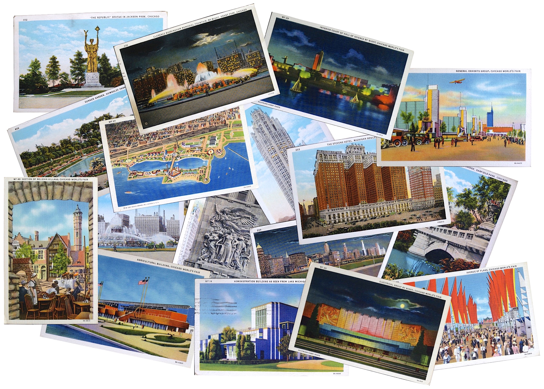
That type of visual lined up perfectly with the streamlined art styles of the ‘30s and the “Century of Progress” World’s Fair taking place in Chicago in 1933 and 1934, for which Teich made a boatload of colorful souvenir cards. Our museum collection highlights a selection of these cards, which are about evenly split between the established C.T. American Art style and the new C.T. Art Colortone, ironically displaying the realtime progress of Curt Teich & Co.
Interestingly, there was no exclusive contract for Teich or anyone else to depict “official” views of the Chicago World’s Fair, so the market was flooded with thousands of different cards by established companies like the American Colortype Co. as well as upstarts like the Arena Photo Post Card Co. and traditional book publishing houses like R. R. Donnelley & Sons. It was a far cry from the 10 or so cards sold at the Columbian Exposition. This might be why Teich opted to partner with the Max Rigot Selling Company to produce most of its Century of Progress series, as Rigot had 30+ years of experience in the postcard game, as well.

[Left: A Teich Color Chart used for its Art Colortone prints. Right: One of the 1933 Art Colortone World’s Fair cards from our museum collection. Teich produced these in a partnership with the Max Rigot Selling Co., a longtime Chicago postcard dealer]
Much like the early Technicolor feature films coming out of Hollywood during the same period, Teich’s linen cards simultaneously looked more like reality than ever before, but also a bit uncanny, or “hyperreal.” Some of the bold, idealistic style of these images could have been a direct reaction to the dreary state of the country—whether conscious or subconscious—or it might have just been a fortuitous coincidence. Either way, postcards like Teich’s glowing night views of downtown Chicago reflected a progressive, electric, exciting world, just as the main street and advertising cards of the decade suggest a society operating as the best version of itself, in spite of what the people could see with their own eyes at unemployment lines or political developments overseas.
For those who did find employment in the Teich factory itself, it was a unique experience, and often a rewarding one, as a former teenage employee named Bob Popelka recalled years later in a letter to the Tribune in 1974.

“When I was 16,” Popelka wrote, “I went to work for Curt Teich as an apprentice lithographer. It was either that or spend the rest of my life making nickel hamburgers on the night shift at White Tower. That was back in 1942.
“The setup was this: You worked four years as an apprentice lithographer. then you became a journeyman, and boy did they make a lot of money. That’s what our boss said. We got $12 a week to start. Out of that they took 50 cents a week to pay for our Thayer & Chandler airbrushes (they cost $25, so we’d get ours paid for in a year).

What we did was hand-paint the separate colors (red, yellow, and blue) in such scenes as the Sandusky, Ohio YWCA or the ranger’s lodge at Onondaga State Park. Then they’d put the colors in register with the black-and-white photograph—and that was a color postcard. The most fun was airbrushing fluffy little pink clouds in the sunset skies. Every card had a pink-cloud sunset.
“We were a fun-loving lot. New apprentices were baptized into our prankish ways with a shot of benzol in their chairs just as they sat down. More inventive schemes included killing cockroaches with benzol and then gluing them to the day shift’s artwork, marching them across those pink-cloud sunsets like a little caravan.
“I was at Curt Teich nearly a year, until just a couple of short weeks before I’d be making $14 a week and have the airbrush paid off. Then I got drafted into the Army, where I earned $21 a month.”

[Some pink clouds put to use in one of the 1933 World’s Fair views from our museum collection]
VI. Mapping a War
Curt Teich, Sr. likely overworked himself to keep up the all-important volume of production during the Depression, taking regular international trips to secure orders and distribution in new markets. In 1939, at the age of 62, he suffered two separate heart attacks, and was forced to take a step back, handing over day-to-day operations in Chicago to Curt Jr. and veteran print manager Frank Hochegger.
Curt Teich, Jr. (b 1910) had yet to even turn 30, but he would soon be in charge of the largest postcard factory in the world—just as the events of World War II would completely redefine its purpose.

[On the occasion of Teich & Company’s 40th anniversary in 1938, the firm’s top executives were given the full Colortone postcard process themselves. From left: Curt Teich Sr., Frank Hochegger, and Curt Teich Jr.]
From 1942 to 1945, an estimated 90% of the plant’s production shifted to military contracts—specifically, a top-secret arrangement with the U.S. Army Corps of Engineers to make manuals and maps for the servicemen overseas. As was the unfortunate norm of the period, Teich’s Japanese-American employees were forbade from being involved in this work or even entering the mail room (the same rule clearly didn’t apply to the many German-Americans on staff), as more than 3 million maps, in total, were eventually produced—counting for about 50% of all maps used by the army. A letter sent to Teich from the Corps of Engineers in 1943 attests to the important contributions of the factory, and the unquestioned allegiance of this German-built business to the country that helped it succeed:
 “The Army Map Service is greatly pleased with your excellent work in the recent reproduction of the Maps of Italy. Your splendid co-operation made it possible to ship these maps two days in advance of the anticipated date. It is gratifying to know that you can be depended upon when confronted with an urgent and imperative requirement. It will be appreciated if you will extend this commendation to all those of your personnel who had any connection with this work.”
World War II affected Teich & Co. on a much more personal level, as well. While Curt Jr. ran the factory, his younger brothers Walter and Lawrence both went into the service. Lawrence E. Teich, born in 1918, had just started working for the family business when he was called to active duty in 1941, about nine months before Pearl Harbor. He was a graduate of M.I.T. and the Northwestern Military Academy, and quickly became an army lieutenant and aviation ordnance officer serving with the 692nd Ordnance division in the Philippines. When the Japanese invasion of Bataan began—the day after Pearl Harbor—Lawrence soon went missing, beginning several years of desperate pain for the Teich family, who were left to hope he might yet be discovered in a POW camp. Sadly, he was never found, and the Army officially declared Lawrence Teich dead in 1946.
Somehow, in the midst of all this, Curt Teich, Jr. still had to keep the future of postcards in the back of his mind, and how the company might be positioned to succeed once the war was over.

[Only 10% of Teich’s factory production remained with postcards during World War II, and those they did produce were often of a patriotic nature, like the Parachute Troops above from 1944. At right is the obituary of Curt Teich’s son Lt. Lawrence E. Teich, who was lost overseas just days into America’s entrance into the war in 1941]
VII. “A Poor Man’s Medium”
“During World War II,” Curt Teich, Jr. told the Tribune in 1974, “labor and material costs forced card prices up to a nickel apiece. To get people to pay such an exorbitant price for a card, we went into color printing from a color transparency. When you think about it, this is one of the few markets where the product actually improved when the prices went up.”
Things never really went “back to normal” in peacetime. In the late ‘40s, tensions were renewed with the Amalgamated Lithographers of America and the Bookbinders and Paper Cutters Union—both of which claimed that Teich & Co. was refusing to engage in collective bargaining. Then there was the problem of the U.S. Government itself, which—tallying up the numbers from inflated wartime postcard sales— was now eager to raise the long-standing 1-cent rate on private postcards on a permanent basis. Teich & Co. were strongly opposed, noting that a similar experiment to move the rate up to 2 cents had cost them 50% of their business back in 1925. Curt Teich, Jr. even testified before Congress in 1949 to state his case.

[The gang celebrates 50 years in the postcard game, 1948]
“Our cards are used primarily by people who go on vacation, such as to the national parks,” he told the Committee on Post Office and Civil Service. “They write back to friends and their families, and send a picture of where they have been. It is purely, as you might call it, a poor man’s medium,” he added, noting that people would just opt to send a letter if the postcard rate increased. This was, quite obviously, a losing battle in light of inflation rates. After 50 years, the penny postcard just didn’t make sense anymore.
Similarly, Curt Teich & Co. seemed a bit stuck in their ways when it came to post-war postcard printing, as well. Despite their advancements during the war with natural color printing from original transparencies, the firm continued to produce the vast majority of its stock in the linen Art Colortone style they’d been using for 20 years. By the time Curt Jr. recognized the error and re-routed the ship toward the plastic-coated CURTEICHCOLOR process, various new shiny Kodachrome-derived cards were already cornering the market, replacing hyper-realism with just plain old boring photo-realism.

Through the 1960s, Teich & Co.—and its once state-of-the-art factory—were both losing their luster. When Curt Teich Sr. died in 1974 at 96, he had already arranged for most of his family’s shares to be sold to the Curt Teich Foundation, suggesting an awareness of a limited future for the company itself.
Several months after his father’s death, Curt Teich, Jr., now 64, was the subject of a Chicago Tribune magazine feature, which dubbed him the “Prince of Postcards.” Upon interviewing Teich in his office inside the Irving Park Road factory, however, Tribune scribe Sue Sussman noted that “the office area is silent, and there is an air of secrecy about the place. Nothing in the building’s downstairs directory or in the fifth floor waiting room indicates the nature of the business being conducted here. If Curt Teich plans to stock your drugstore with views of the Hancock Building shot thru a Michigan Avenue manhole, he apparently doesn’t want anyone to know it in advance.”
Claiming that the factory was still producing millions of cards per week, Teich Jr. showed Sussman a new 15-cent postcard of Chicago’s Sears Tower (also brand new at the time), and noted that the company’s photographers were constantly delivering new scenic views just as they had since the firm’s inception. “They may shoot a place in summer and make a note to return in the fall. Or a new building may go up on a certain street. Look at Chicago. Every time you turn around, a new building has changed the skyline—and that means a new postcard has to be made.”
Less than two years later, that mad, inspired chase to collect and rectangulate every new view finally came to an end. Curt Teich & Co. was sold to another longtime Chicago litho publisher, Regensteiner Publishing Enterprises, and by 1978, the factory and the Teich name brand were officially retired after an 80-year run documenting the world in 3.5” x 5.5”.
In 1982, Regensteiner donated the enormous Curt Teich & Co. archive to the Lake County Museum (then in Wauconda, Illinois), with Ralph Teich providing additional cash from the Curt Teich Foundation to fund an ongoing exhibit. The collection has more recently moved to the Newberry Library in Chicago, but after nearly 40 years of analysis, it’s still not been completely sorted through.

[Curt Teich Sr.’s youngest son Ralph Teich, above, helped create the official Teich Postcard Archive Collection in 1982. It’s now housed at the Newberry Library in Chicago]
“Dad always saved 15 cards from every scene produced,” Ralph said at the time. The millions of the cards in the archive are just part of a collection that also includes a remarkable amount of notes and minutia related to the postcard design process, including random artifacts like samples of patterned wallpaper that clients sent to give artists a guide on how to paint a business’s interior. That sort of attention to detail is what keeps the various perspectives provided by Curt Teich’s view postcards still fascinating all these years later.
“Postcards are more than attractive things to look at,” Ralph Teich opined during the launch of the Teich archive collection. “They are a communication device that brings people, places and memories together and holds them. There probably is a postcard in every home in the world. But nothing ever was done to document a history of them until now.”


Sources:
Newberry Library: Curt Teich Postcard Archives
Postcard America: Curt Teich & the Imaging of a Nation, 1931-1950, by Jeffrey L. Meikle, 2015
“O, Those Sunsets . . .” Letter to Editor, Chicago Tribune, July 21, 1974
National Register of Historic Places: Curt Teich & Company Building, 1990
“View Postcard in Demand” – The American Stationer, Aug 24, 1912
“Prince of Postcards” – Chicago Tribune, June 16, 1974
Tariff Schedules: Committee on Finance, U.S. Senate – “View Post Cards,” 1913
Hearings Before the Committee on Post Office and Civil Service, U.S. House of Representatives – “Postal Rate Revision,” 1949
“Guide to Dating Curt Teich Postcards” – Newberry.org
“‘Wish You Were Here’ Exhibit Donated” – Times-Press (Streator, IL), Aug 5, 1982
“Curt Otto Teich (1877-1974),” by Shana Lopes, Immigrant Entrepreneurship.org
“Interesting Color Processes in the Production of Post Cards” – The National Druggist, September 1907
“Color Processes” – The American Stationer, Aug 17, 1907
“History By Mail” – Chicago Tribune, January 2, 1994
My Dad Otto Brockmeyer was a photographer salesman for Curt Teich from the 1930s,through the 1960s. His territory was Illinois especially about president Lincoln, Kentucky,Missouri, Indiana and Arkansas. My mom and I were in a card from Lilacia park in Lombard and Pilcher Park Joliet Illinois. His photos say photo by Brock on the back.
I recently found a Curt Teich & Co,. 24-panel postcard from 1937 of the Famous Buckhorn Curio store Museum, now known as the Buckhorn Saloon and Museum in San Antonio, Texas. The museum, at one time, was housed in the Lone Star Brewery where as a child my cousins and I would ride our bikes to it to walk through the oddities museum. Such a treasure to find this great brochure and in mint condition still in a plastic holder.
Just want to know where would I sell any of the postcards from 1941 and below
I have found these postcards in my mommoms affects and with a book of Grand Canyon national park with a 3 cent stamp to mail to her family and was wondering how old it might be.
Did Ted Mundorff, Hawaiian artist during the 40’s ever paint greeting cards for the Teich company? Specifically one entitled “We are Prepared- Hawaii 1941”
I have a Panama City Beaches14 cards souvenir. Would you have any idea as to how old it may be ? It has a number on it D-13667 All says Cooper’s News Agency,
Panama City, Fla. Curteichcolor 3D Natural Color Reproductions (Reg. U.S.A.Pat.Off.)
Ref: Series No. I-S, Art Scenic views (20 subjects), divided back, 1 Cent stamp, on front Bellport, Long Island 3A-H793.
The scene depicts cows in a rivers and high hills in the background. The picture does not look familiar at all. Long Island is relatively flat, especially Bellport which is located on the south shore. Could this be an error when printing the location? Would a location be added to a random scene? It is a mystery that you may have the answer for. Thank you for any clue.
Hallo und guten Tag, wir schreiben Ihnen aus Germany, weil wir einige Fragen an Mr. Ralfph Teich haben. Unsere Tante Mrs. Maqria Ritter, Largo, Florida hat Mr. Curt Teich bis zu seinem Tode in seinem Haus in Florida als seine persönliche Krankenschwester gepflegt. Sie hat von Mr. Curt Teich ein Album mit illustrierten Karten geschenkt bekommen, das von MAX SALZMANN – Maler – stammt.
Nach dem Tode unserer Tante, haben wir in Ihrem Nachlass dieses Album entdeckt, mit einem persönlichen Brief von Mr. Max Salzmann an Mr. Curt Teich (15. August 1945). Die Aquarelle von Mr. Max Salzmann handeln humoristisch von einem Krankenhausaufenthalt.
Können Sie uns eine Verbindung von Mr. Curt Teich und Mr. Max Salzmann herstellen?
Wer ist Mr. Max Salzmann. Wir glauben die Antwort kann am besten Mr. Ralph Teich beantworten.
Ich kenne Mr. R. Teich persönlich aus Florida.
Wir würden uns über eine Antwort von Ihnen freuen.
Best regards
Helmut Müller
Greetings I have a old barrel fold Greetings from the Happy South
Im looking for the value of this unit. this is very vintage
perfect condition = there is a code on back cover – 1033
My grandfather Herald Harpling was a vice president I believe. He is in the 50 year anniversary photo with all the men.He is seated right between the 2 men seated on the right side. That was 1948 so my father Robert was 5 then..He also worked there for years he ran the plate department & I would sometimes go there with him on weekends.And ride the big elevator up.I can still remember the smell of the place.Very cool to read this article & see the photos.
This is beauty of days in the past . A piece of paper, received in the mail. Within my heart and memory will dwell.
I know and believe, if a word to be spoke, received on a card, was a Special event, I Love You , written upon a beautiful card.
Priceless
Thank you for this informative article. I will promote it in my presentations for Illinois Humanities — “The Happy Invention: History and Significance of Picture Postcards.”
Kind regards,
Katherine
How much are Curt Teich post cards wroth today?
As one of Curt Teich’s grandkids, I thank you for this wonderful article about ‘the plant’ and the family. It brought back a lot of memories.